A Swell Party if Your Cup of Gin Is Pavlovian
Sep05
Suggested wine pairing: pinot noir.
Things have changed around here! The idea was to make the site more fun and easier on the eye. The change is mostly done, but if you come across something that isn’t working right or is otherwise wonky, please let me know!


Woah, new site design! I like it. Very mountain-y.
How many bores could a boarbear bear if a boarbear could bear bores?
Yes, it’s very mountainy, and long overdue, I think. We’re still hammering out some kinks, but it was definitely time for new comics.
And my estimate is 14 bores.
The storylines are quite wonky. Don’t you dare ever change that.
Whoa, nice new loge! .. lohg. Sometimes it’s hard to abbreviate.
Hmmm I think I liked the site better before though. Mainly because I look at comics with my bookmark toolbar open, so if things aren’t left-aligned I have to scroll over to the right a bit. But I’m sure I’m in the minority there. I just know it worked great before.
Oh and this comic is damn funny.
I’m sort of with Cold, in that worked great before. Also, a few ideas for formatting and stuff:
-Those borders and slightly rotated profile images from a few days ago were really doubleplusgood, and I’m not sure if they have disappeared intentionally, or something in between has glitched out.
-I personally have an issue with the font for the “home about characters..”
-In other words, it’s nearly perfect.
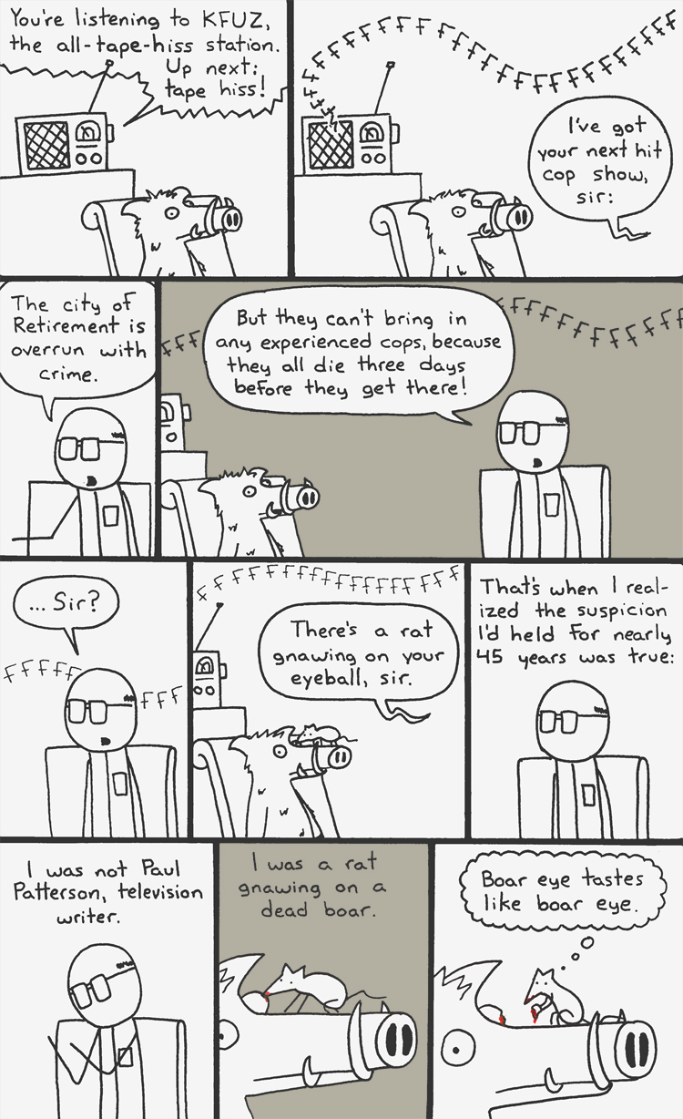
I swear you did the tape hiss just to draw in as many F’s as possible. It was beautiful.
In my opinion, anyway, that is a better cop show idea than Cop Rock. Both of them are hilarious though. https://www.youtube.com/watch?v=gLm5Sn1cMyQ
also, Léguuuuuuumaaaaaaaaaaan
Klear: Drat. There go my plans of turning Mountain Time into a dom com that deals with growing up in suburban America.
Cold: I’m not entirely sure what you mean about the alignment; all the alignments and dimensions should be exactly like they were before. What browser do you use?
Cold & Gandapestile: Yeah, it DID work great before. On my end of things, it worked BETTER before. All I really wanted to do was make things tidier and update things like the cache and the spamguard. But mistakes — and unnecessary “upgrades” — were made, and there was no way to go but this way.
Gandapestile: Léguuuuuuumaaaaaaaaaaaaaaaan!
Cold: A thought occurred to me just now. Would you mind sending me a screenshot of how the site looks when you load it? (Toolbar open and all?)
Another thing, on a 1920 by 1080 monitor the mountains on the side repeat oddly.
Never change things, because when you do, they get rabies, and you can’t even find the background image on the friggin’ stylesheet anymore.
I’m usin firefox.
Sure dude here you go http://postimg.org/image/xha5p2kft/
I blurred out the personal bits but I left my favorites open so you guys can see them. free publicity for those guys!
See, the site used to load so that, with my toolbar open, the comic was still perfectly centered in what remained of my screen (in fact i didn’t even know there WERE colored side bars on the site until that one meta-comic that showed a repeating screenshot of the site
That’s odd. You did see the grey bars before though, right? Or was it JUST the comic?
It also seems slightly zoomed in. It that the size you’re used to?
I’m think I know what the problem is (or at least might be), but implementing the fix is now extra-complicated. Never upgrade things. Newer versions are always stupid.